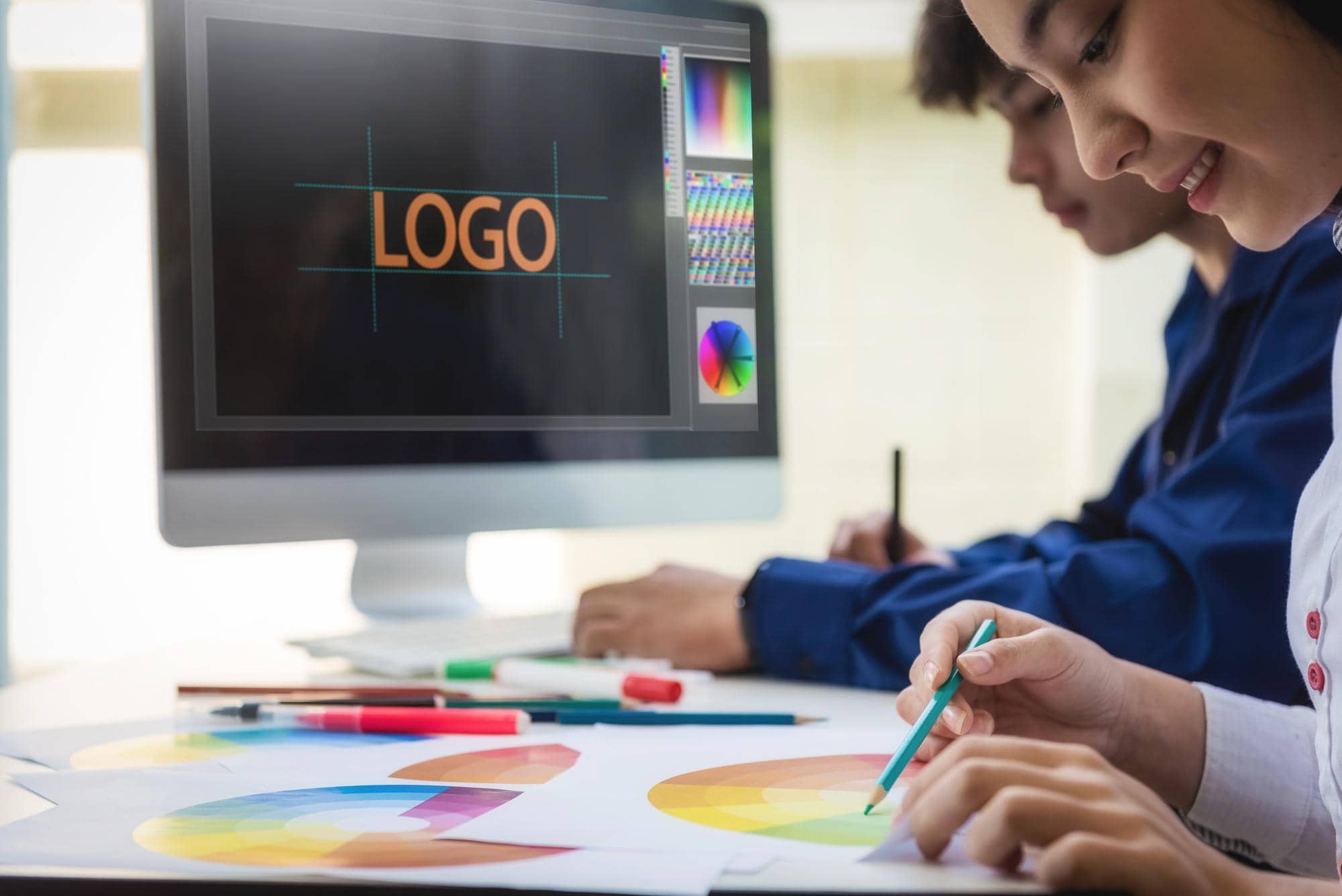
What Is Logo Design and Why Is It Important?
Logo design refers to creating a graphic symbol that represents a company, product, website, or service. A logo captures attention and serves as the foundation of your brand. Have you noticed how many logos you encounter daily?
At its simplest, a logo is a symbol composed of words, images, and colors. Paul Rand, the father of graphic design, said: “A logo is a flag, a signature—not just a mark, but the embodiment of an organization.”
Why Is Logo Design Important?
What impact does a logo have on your business? Let’s take a closer look:
- First Impression: You only get one chance to make a first impression. Your logo is often the first thing customers notice, shaping their perception of your brand.
- Standing Out Among Competitors: In a sea of advertisements and logos, you face fierce competition. A well-designed logo ensures you don’t get lost and helps you stay ahead.
- Identity: A logo defines your business’s identity, helping others understand and remember your brand. Even if customers forget your name, they’ll recall the colors, images, and structure of your logo.
Note: You can hire skilled designers for logo design. However, hiring isn’t always feasible, especially with a limited budget. By following design principles, you can create your own logo.
How to Design a Logo?
Choose Your Design Style
- Classic: A classic style gives your logo timeless staying power, signaling trustworthiness and reliability.
- Modern and Minimalist: This style uses white space and simple lines, conveying that your brand is up-to-date and sleek.
- Fun and Playful: Ideal for youth-oriented products, this style is colorful and features friendly imagery.
Can You Use Only One Style?
No, you can combine styles based on your idea and business needs, such as blending classic and modern elements.
Find Inspiration
Study successful designers and collect competitors’ logos for ideas. Pay attention to details:
- Is the design symmetrical? If not, what creates balance?
- Are the colors complementary, contrasting, or monochromatic?
- Are the lines sharp, rounded, or a mix?
- How are words positioned?
Experiment with word placement to enhance creativity. According to a 2023 study by the Graphic Design Journal, 70% of memorable logos use balanced shapes and colors.
Framing
Frame words around your logo’s symbol, such as within a square or circle, to create cohesion.
Color Combination
Choose appropriate color combinations. We’ve discussed this extensively in our Color Psychology Article. Consider redirecting words or using a non-linear design for uniqueness.
Software
Use logo design software. A quick search reveals various options, but ensure your design maintains high quality.
Sketch Your Ideas
Use pen and paper to sketch ideas. Don’t discard failed designs—compare them with others. You might combine small elements from each to create your ideal logo.
Is Logo Design Necessary for Small Businesses?
A logo is beneficial for business growth, as outlined above. You can start without one, but as your business develops, a logo becomes essential for expansion and recognition.
What Makes a Successful Logo?
Simplicity
Why? Most successful company logos are simple, using basic shapes, forms, and one or two colors. Complex, noisy, or vague designs can be self-destructive. Simplicity enhances memorability.
Distinctiveness
With over 2 million major brands worldwide, countless businesses compete for attention. Your logo must be recognizable and set you apart from competitors.
Readability
If you or others can’t read the company name in the logo, there’s a serious issue. Some brands overstyle letters, making them hard to read. If unsure, ask others for feedback on readability.
Quality
A successful logo must be fully polished. Check if your logo is complete. “Incomplete” doesn’t just mean missing letters—it could mean a cluttered or unbalanced design.
Typography
Start with a good font. Typography is crucial, so study it if unfamiliar. Color choice for fonts is equally important. Avoid using too many colors or poor color combinations. Incomplete shapes or improper spacing are common logo design mistakes.
Logo Design Techniques with Examples
Repetition
Repetition may seem monotonous, but it can draw attention to another part of the design. This technique is highly effective and widely used by designers.
Contrast and Breaking
Breaking part of the text subtly—without disrupting readability or recognition—creates visual interest. Strategic color contrast can significantly enhance your logo’s appeal.
Balance
Proper balance and spacing in letters, along with symmetry in shapes and text, prevent clutter and improve readability.
Emphasis and Quality
When part of your text stands out more than other elements, it becomes the focal point of your logo. This may seem to contradict balance but is a strategic way to draw attention to a specific part.
Symmetry
Symmetry makes your design appear cohesive and professional, contributing to balance.

Creativity
Creativity makes a design memorable. A unique idea, distinctive shape, or bold color combination sets your logo apart.
Professional Design
Once you master design principles, you can work more professionally, stepping outside conventional rules—not ignoring them, but using them uniquely to create stunning designs. A well-structured logo with surprising elements can be highly effective.
Tip: Decide upfront which part of your logo you want viewers to focus on and what information they must see, then structure accordingly.
Analysis of Successful Logos
The best logos endure over time and remain memorable. Let’s examine a few:
Adidas
Producing sportswear is a highly competitive business, requiring a memorable logo, especially since sports are global. The three-stripe logo, chosen from hundreds of ideas, represents the Americas, Europe, and Asia with its three-leaf shape.
Red Cross
A cross with equal sides on a white background, symbolizing neutrality and protection, designed in 1863.

Nike
Nike’s swoosh, designed by a Portland student in 1971, is a simple yet iconic global symbol of victory. Registered as a trademark, it has remained largely unchanged despite minor tweaks to the “NIKE” text.
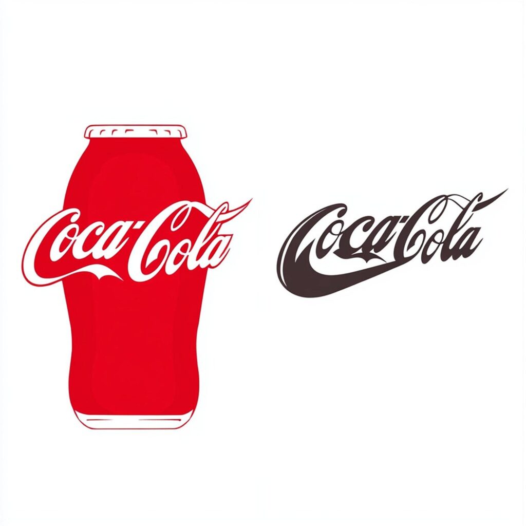
Coca-Cola
An old logo created by Frank Mason Robinson, it has barely changed over time. Minor tweaks, like shifting from black to red or vice versa, evoke nostalgia. The red color conveys excitement and energy, aligning with Coca-Cola’s brand identity.
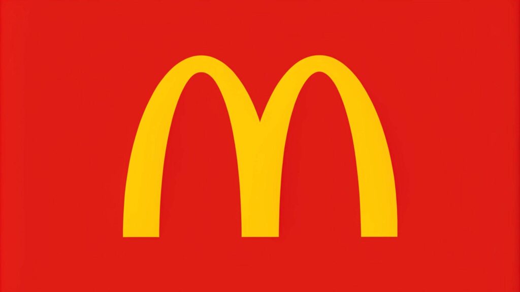
McDonald’s
Serving over 69 million customers daily across 100+ countries, McDonald’s logo was designed in 1952. The McDonald brothers asked an architect to design their building, who proposed two golden arches. These later formed the “M” logo. Years ago, it was said no two countries with McDonald’s would go to war, though Russia’s invasion of Ukraine disproved this.
Conclusion
We explained the importance of a logo and its role in business growth, outlined its benefits, and described how to design one while highlighting key considerations. We also analyzed several successful logos. A well-designed logo is crucial for standing out and building a lasting brand.